The Problem
I designed and built a website for Lifeline Fire Protection. A few months after it launched, the client came back with news. The company had grown into a family of four companies under one parent name, Lifeline Group of Companies.
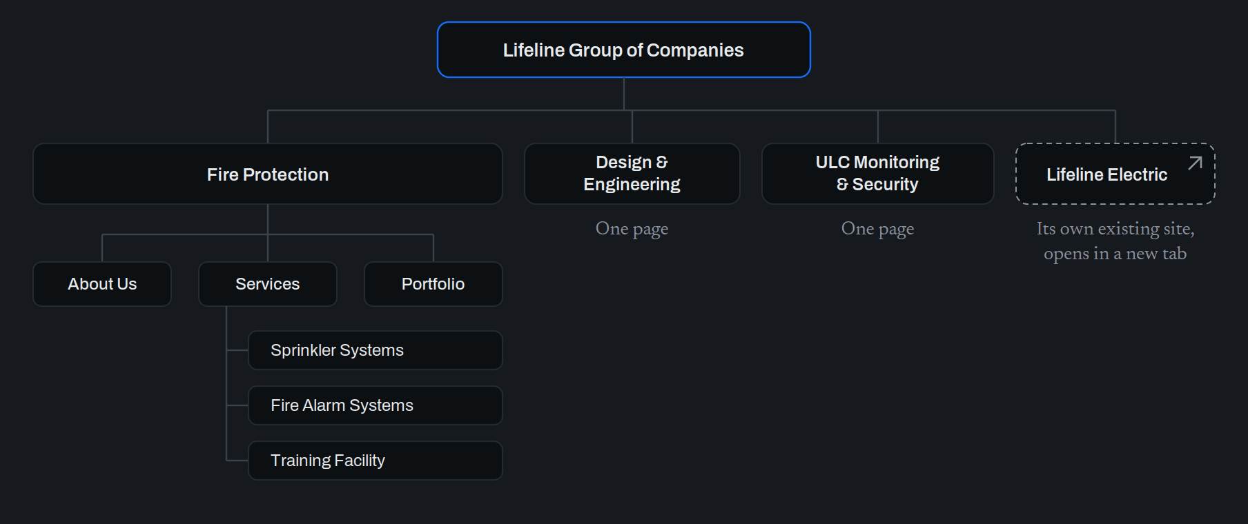
Fire Protection was now one of the four. The others were Lifeline Design & Engineering, Lifeline ULC Monitoring & Security, and Lifeline Electric. The client wanted one website that could hold all of them.
Fire Protection already had a full website's worth of pages. Design & Engineering and ULC Monitoring & Security each needed just one page. Lifeline Electric already had a website of its own, and the client wanted visitors sent there.
That set up the real challenge. Four companies would now share one name and one website. At every step, a visitor needed to know which company they were looking at, and how to get back.
Their Sketch
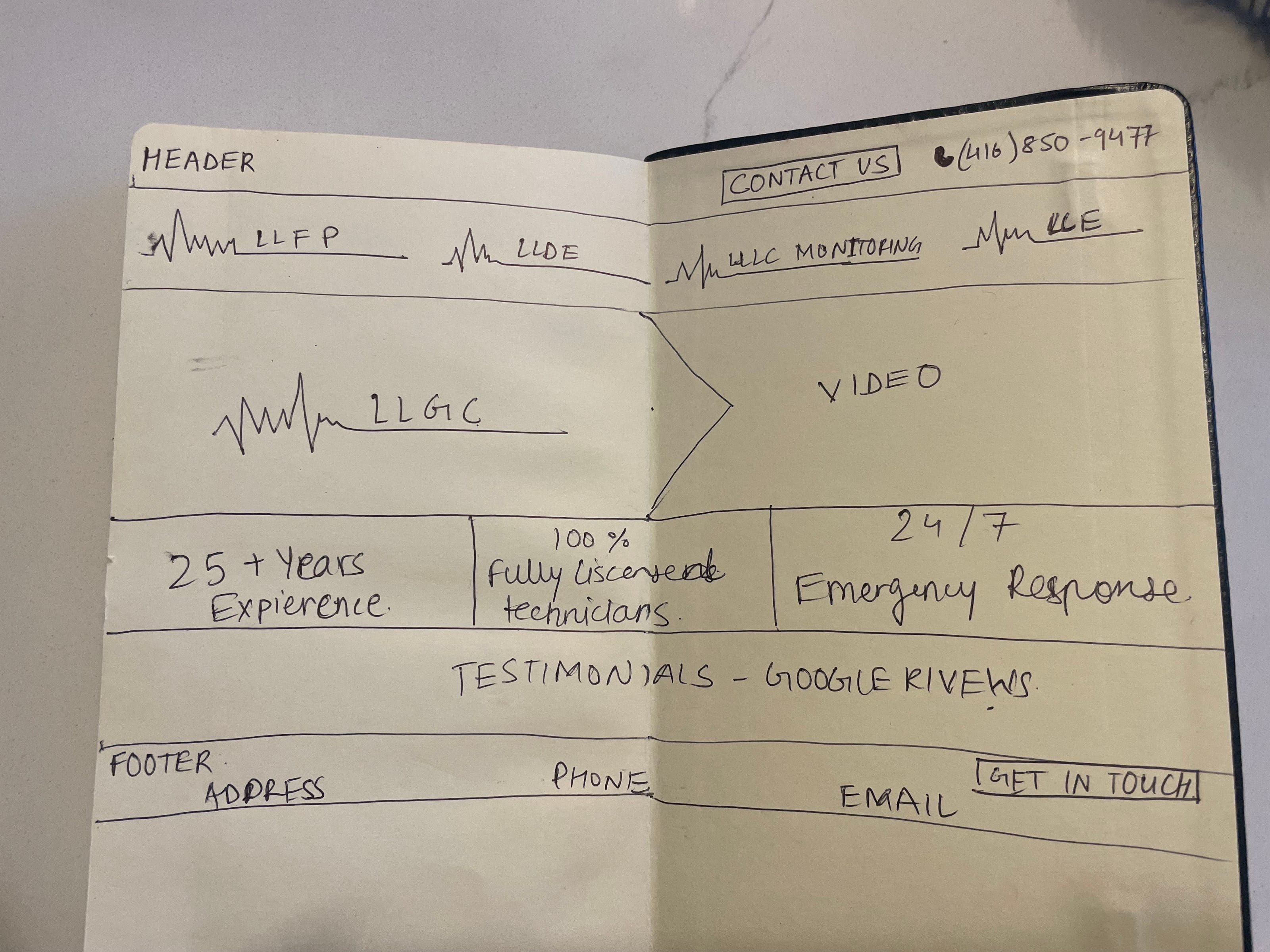
The client came with a clear idea, drawn by hand in a notebook.
At the very top was a thin bar with a Contact Us button and a phone number. Under it sat the four company logos in a row. Those logos were the menu: click a logo, and you land on that company's page. Below that, the parent logo sat on the left, with a video beside it on the right.
They had also sketched a menu just for Fire Protection, with About Us, Services and Portfolio. The idea of Fire Protection as a site within the site came from them.
Building It First
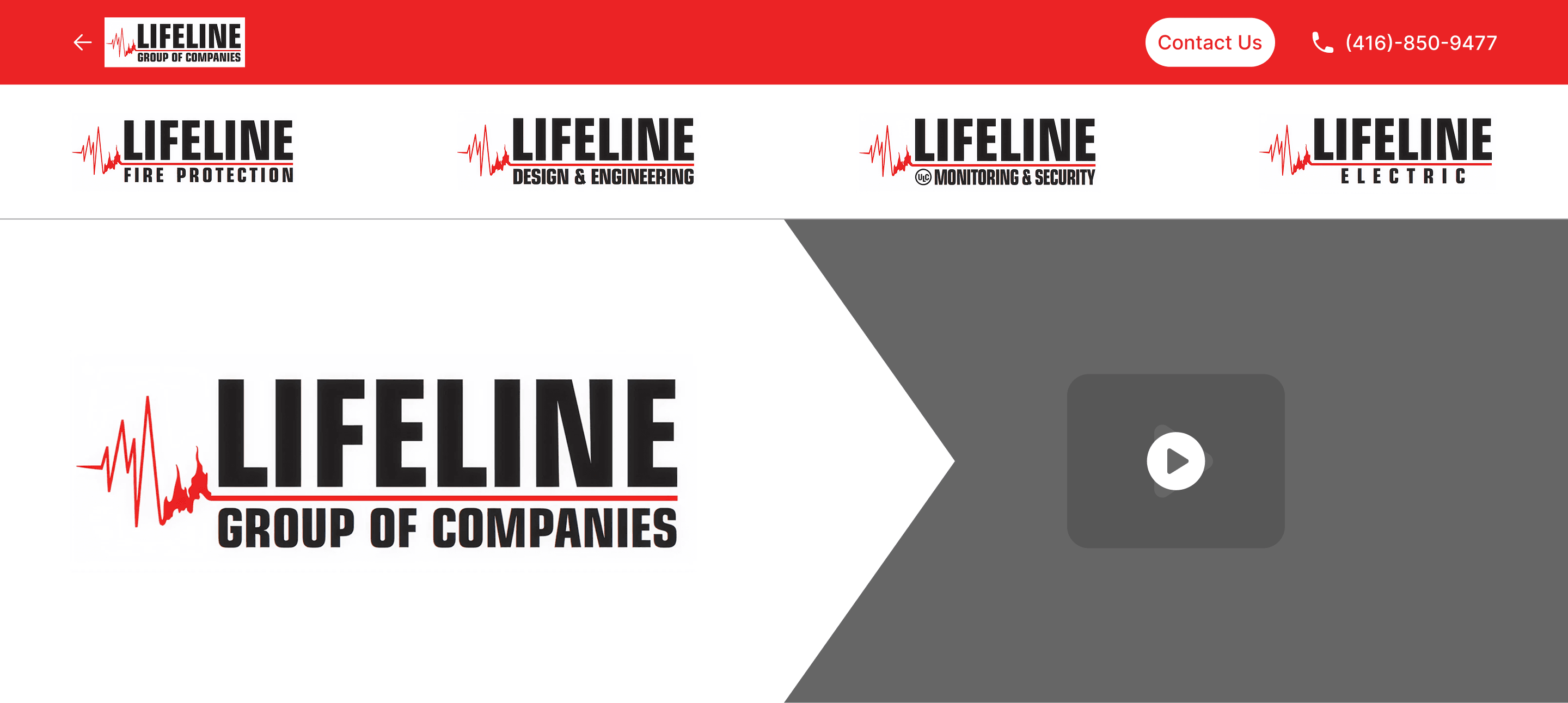
Before I raised any concerns, I built their idea exactly as they drew it, as a high-fidelity design in Figma.
I did this on purpose. An idea is hard to judge from a sketch and easy to judge once you can see it. I also wasn't sure it would fail. Using logos as a menu is unusual, but it isn't wrong by default. The best way to find out was to build it and look.
Pushing Back
Once I could see it, the answer was clear. The logos looked like a row of brand badges, not a menu. Nothing told a visitor they could click them. Someone new to the site could scroll right past the only way to reach the four companies. That is a discoverability problem.
There was a second problem. All four logos said LIFELINE in big letters. A visitor saw the same word four times in quick succession, and the only thing that told the companies apart was the smallest text on each logo.
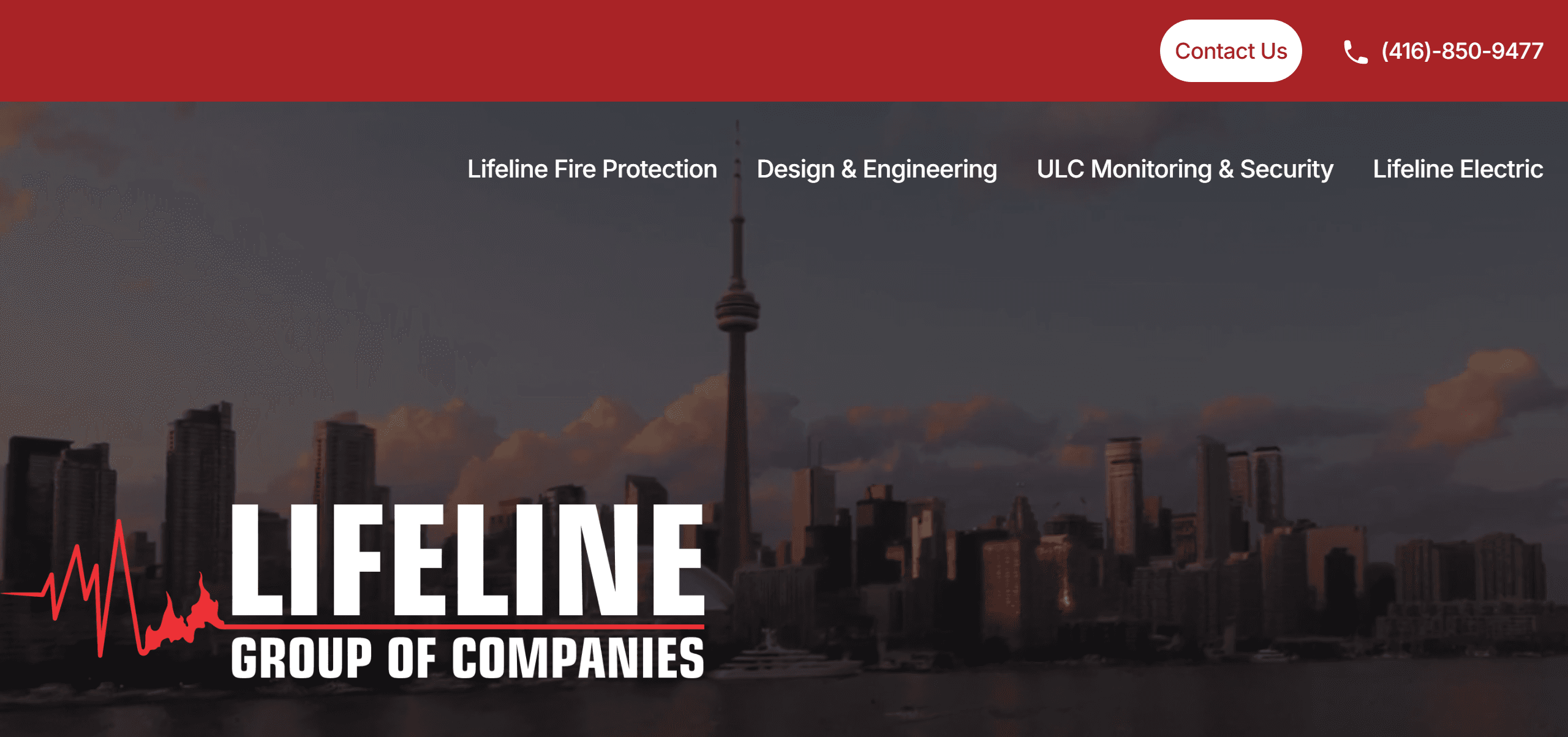
So I recommended plain text links. Each link leads with the company's own name, the one detail the logos buried. The client had already felt uneasy about the logos, and they agreed.
They also had a concern of their own. The video was grabbing too much attention. I suggested moving it behind everything else and darkening it, so it sets the mood without competing with the logo or the menu. They liked it much better.
I actually preferred the video the way they first drew it, and I still do. But the concern was theirs to weigh, and this answered it.
Knowing Where You Are
With four companies under one name, a visitor can easily lose track. Which company am I looking at? How do I get back to the start? The site had to answer both questions on every page.
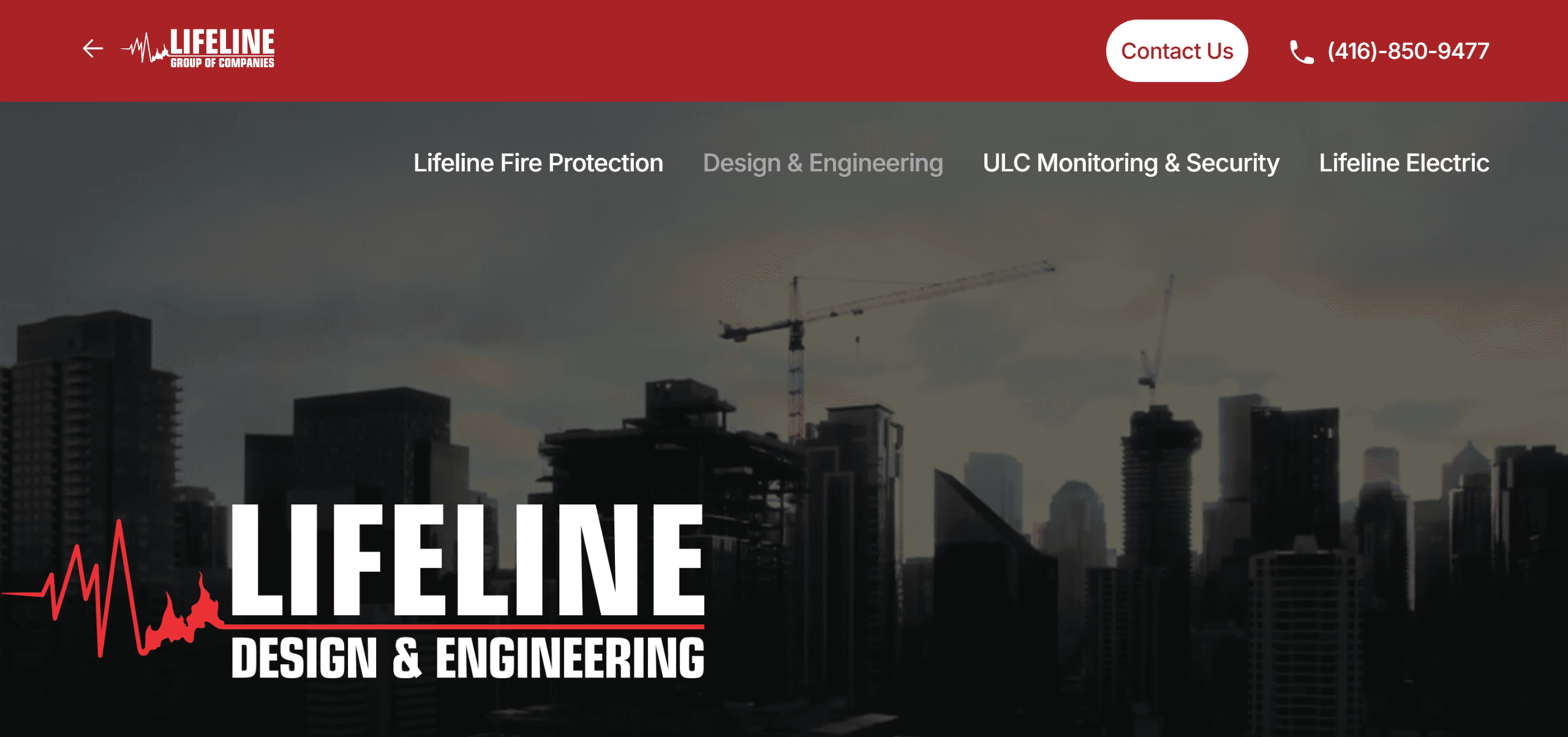
My answer was to move the parent logo. On the homepage, it sits large over the main image. On every company's page, it shrinks and moves up into the red bar at the top, next to a back arrow. The company you're visiting takes the big spot instead.
That gives the whole site two simple rules. The biggest logo on the screen tells you where you are. The top-left corner takes you back.
On the two smaller companies' pages, the menu stays the same. The company you're on is simply greyed out.
Fire Protection is different, just as the client planned. It swaps the menu for its own logo and its own pages.
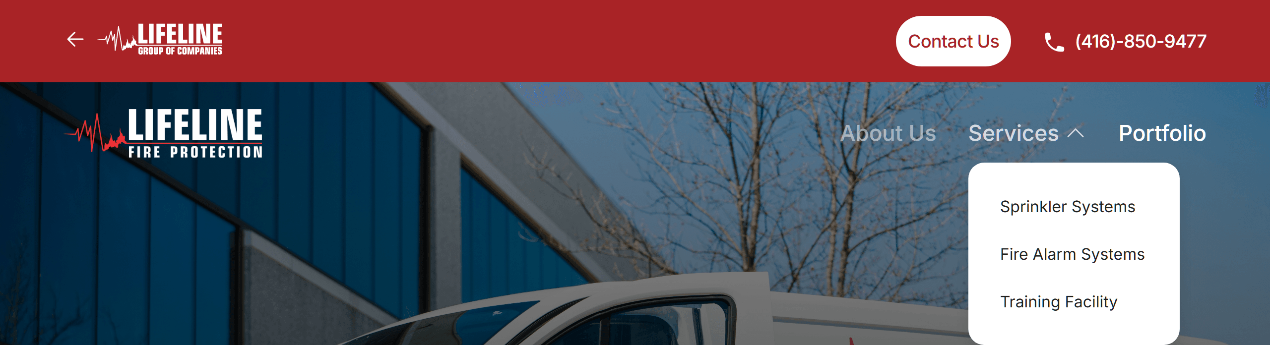
The red bar at the top never changes, and that is what makes the switch safe. However deep a visitor goes into Fire Protection, the way back out sits in the same spot it does on every other page.