The Problem
Holy Trinity Armenian Church had decades of ministries, services, and community organizations, and no coherent way to present any of it. The old site organized everything by internal category rather than by what a visitor actually needed: a top-level "Organizations" bucket held everything from the youth centre to the women's committee to Sunday School, three clicks deep before you found what you were looking for. Requiem Service and Request for Prayer, two of the most time-sensitive things a grieving family might need, were duplicated across two separate sections. There was no way to book a baptism, a wedding, or a memorial online. Every one of those started with a phone call.
The Old Site
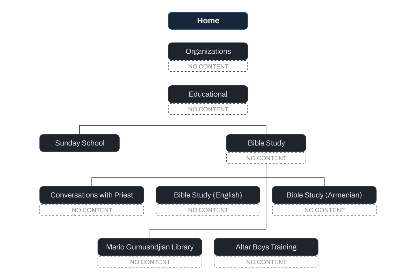
Before designing anything new, I mapped the existing structure to see the problem clearly rather than assume it. The old site nested four and five levels deep in places. Bible Study alone had five child pages, buried under Educational, which was itself buried under Organizations. That depth is where people give up.
Navigation
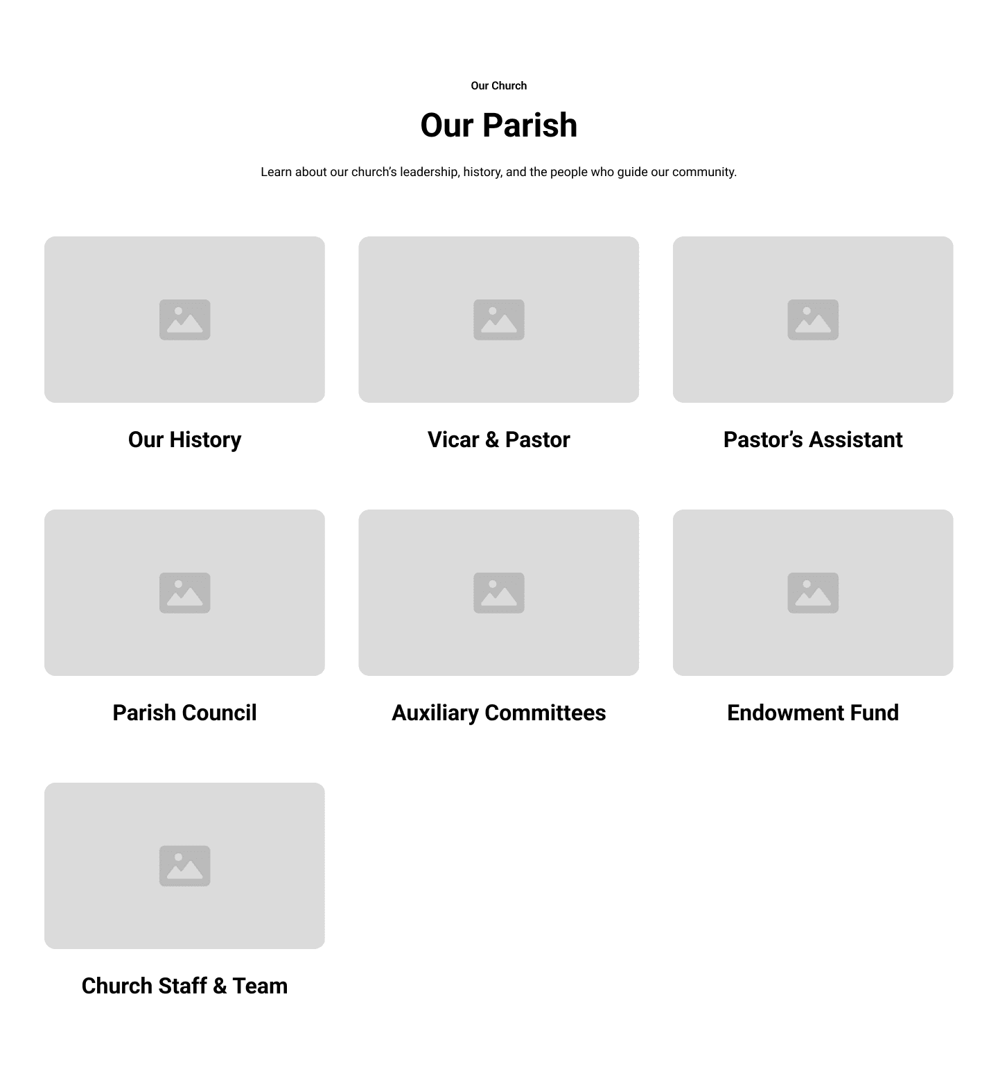
Rather than rebuild the same nested dropdown pattern with better labels, I moved away from deep navigation entirely. Instead of a flyout menu revealing sub-pages on hover, top-level sections like Our Parish became landing pages of cards, each one a clear entry point to a specific page. A visitor sees their options laid out rather than hunting through a menu that opens onto another menu. The navbar stays shallow no matter how much content sits underneath it.
The navbar itself took longer to get right. In the wireframes, the client asked for their logo centered at the top with the navigation links and buttons stacked underneath it, because the logo was wide and there were too many links to fit on a single line.
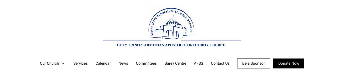
I moved away from that in the final design for a practical reason: the text inside their logo became unreadable at small sizes. So I designed a simplified, more minimal version of the logo built specifically for web use, which freed enough horizontal space to put everything back on one line.

That still left a responsive problem. Even on one line, the links would start colliding as the viewport narrowed. Rather than jump straight to a hamburger menu at a single breakpoint, I set several breakpoints and collapsed the navigation progressively: at the first point of collision, a "More" dropdown appears and the longest, least essential link, Committees, moves into it. At the next, AFSS follows. Links keep folding into More one at a time until the screen is genuinely small enough that a hamburger menu is the right pattern.
The result is that a visitor on a tablet or a small laptop still sees most of the navigation directly, instead of losing all of it to a hamburger the moment the window gets a little narrower.
Planning With the Client
I built a full sitemap and walked through it with the client before a single wireframe existed, revising it together until we both agreed on the structure.
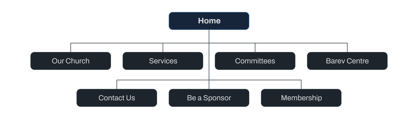
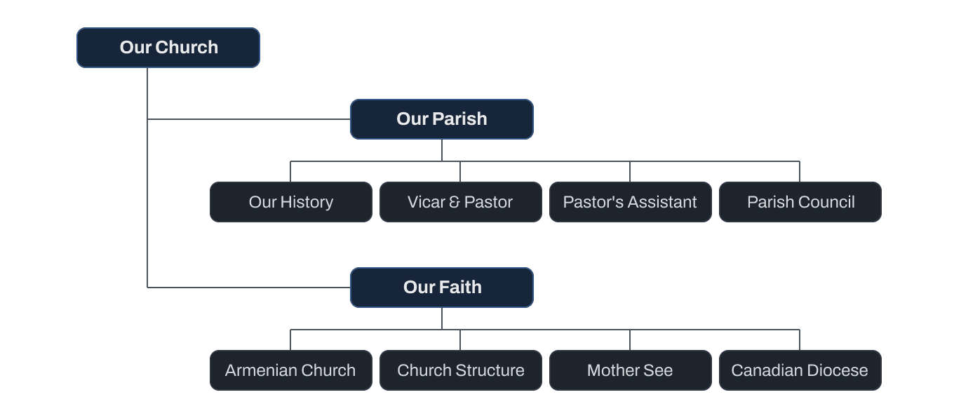
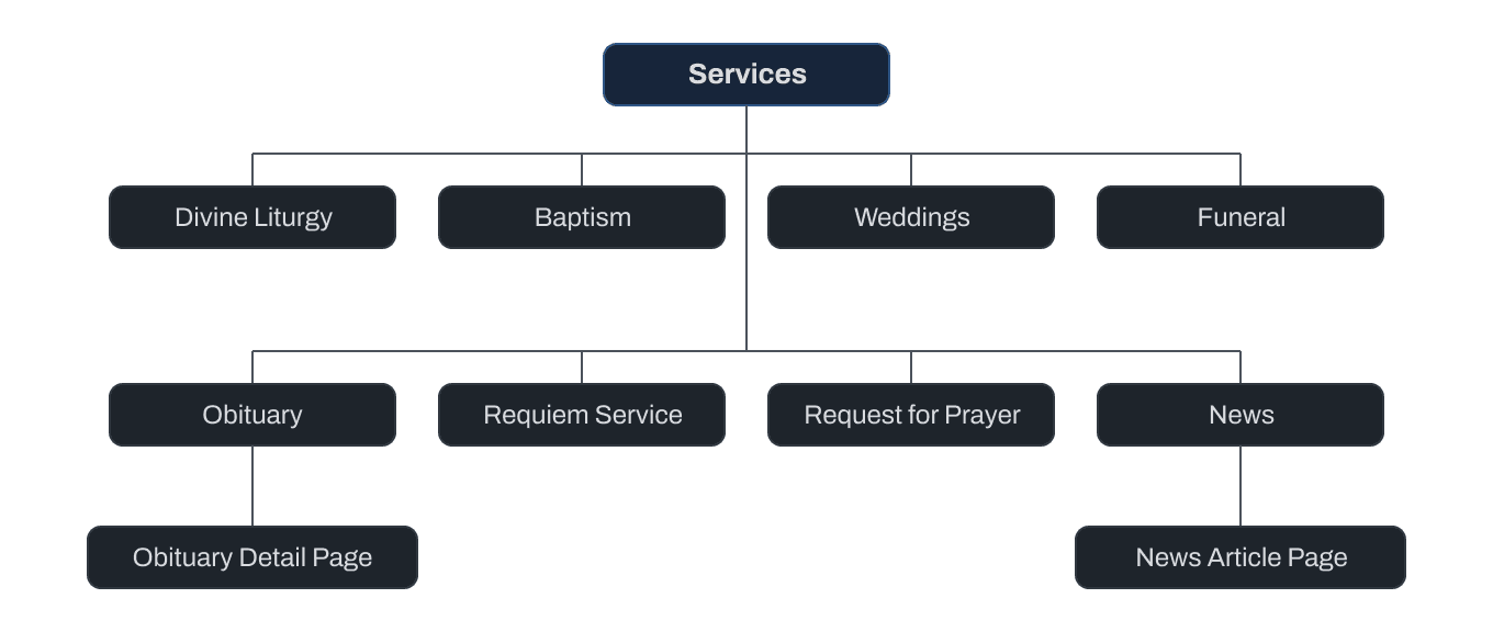

That sitemap became the foundation for the wireframes: every page, laid out low-fidelity in Figma using Relume components, black and white, no styling, with the actual page copy already drafted at that stage. Content and structure got solved together, not layout first and words later. Keeping the wireframes deliberately unstyled also kept client feedback focused on what the page said and how it was organized, rather than on colour and imagery that hadn't been designed yet.
What Changed
The agreed sitemap didn't survive contact with the real content. As I built out wireframes page by page, the client kept remembering things they'd left out.
Services grew from 8 planned pages to 16 live ones: funeral preplanning, memorial headstones, gravesite prayers, baby blessings, home and work blessings, hospital visitation, seniors' visitation, church hall rentals. Each one a real pastoral offering nobody had thought to list until they saw the page taking shape. Committees grew from a single planned page to 16, as the client realized how much of their parish's actual community life wasn't represented anywhere.
Other things moved. News was pulled out of Services and up to the top level, because burying announcements inside a services menu made no sense once there were sixteen services. Content about the wider Armenian Church, planned as its own top-level category, was folded into Church Structure and Leadership, where it sat more naturally beside information about this specific parish's own structure.
I never went back and formally revised the sitemap to match. The structure absorbed the growth instead: because Services and Committees were built as flexible, list-based sections rather than a rigid hierarchy, doubling their size didn't require re-architecting anything. The plan was a starting point, not a contract.
Beyond the Brief
The client never asked for this. In conversation, they made clear that two things mattered more than anything else on the site: getting people to donate, and getting people to show up to events. Nothing in the sitemap or the wireframes addressed that directly. It was a business priority, not a page.
I designed around it anyway. A primary Donate call to action, always visible in the navbar. A Get Involved dropdown consolidating three previously scattered actions, membership, volunteering, and sponsorship, into one clear place. And two persistent floating buttons, Donate and View Upcoming Events, sitting in the corner of the screen on every page regardless of where a visitor is in the site. It's a small pattern, but it's the piece of the design that came directly from listening rather than from a spec.
The Booking Flow
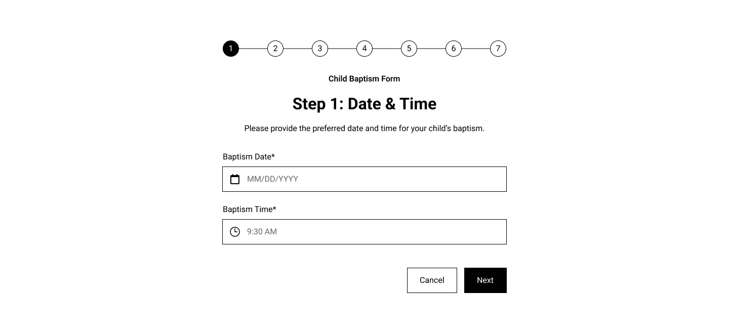
The old site's forms were a single long page per service, sometimes dozens of fields, scrolled top to bottom with no sense of progress and no consistent alignment between fields. People abandoned them mid-way.
When I first saw them, moving to a multi-step format was an obvious call. I asked the client whether any fields could be cut to shorten the form itself, and the answer was no, everything they collected was something they genuinely needed. So instead of shortening the form, I broke it into steps of no more than five fields each. The form is still long in total, but every step ends with visible progress, which is a very different experience from watching one page scroll forever.
Payment was the other problem. On the old site, submitting a form and paying for the service were two disconnected actions. A user would fill out the form, then separately navigate to a general Donate page, find a PayPal module, select what the payment was for from a dropdown, and manually type in an amount. Nothing connected the two. If someone finished the form and never made it to the payment page, or paid the wrong amount, the church had no clean way to catch it. Someone on staff would have to track the person down directly.
On the redesigned site, payment became the final step of the form itself. The amount is already set based on the service being booked, so there's nothing left to select or type incorrectly. Submitting and paying happen in the same flow, in the same place, with no second page and no room for the two actions to come apart.
Outcome
Members told the church directly how much they liked the redesign. More importantly, the thing the old site couldn't do at all now works: people are successfully completing the multi-step booking and payment flows for baptisms, weddings, and memorial services, with no phone call required.